The Chinese, with a population of 1.3 billion (91% Han Chinese), have a very high IQ average of 105. But little is known for the IQ level in different regions of China, whereas geographically and demographically it is simply too vast to ignore the regional discrepancy within the country itself. After an amateur scavenger hunt on the internet I actually did find some Chinese source about the IQ geography in China.
The data I found came from a website that offers self IQ tests for the Chinese netizens. Information such as age, geographical location were collected for the correlation purpose for the test result. The original statistics could be found here (in Chinese). I have constructed a series of simple diagrams for the IQ level by province in China (with the amount of participants in each province), as follows:
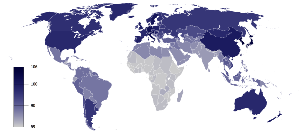
IQ by province in China (excluding Taiwan, Hong Kong and Macau) typo: Tianjian should be Tianjin (mistake in excel)
Number of participants by province (in total 63636)
There are 63,636 participants who took the IQ test on this website from all 31 provinces in mainland China. The mean IQ level of all participants is 106. This is more or less close to the figure given in Lynn’s IQ and Wealth of Nations. Considering the skewed effect of having more participants from regions with apparently higher IQ (e.g. Beijing, Shanghai, etc.), the average IQ level from the test might be slightly deviated from the actual average IQ level of China. Nevertheless, it could still give us a general idea of the IQ geography in China.
IQ level by Province (the darker color means higher IQ average)
There’s a lot to be drawn from the IQ level by province data in China. From a simple glimpse of this IQ map of China, it is evident that the highest IQ level concentrates in the Central Eastern coast of China (around Shanghai, traditionally called Jiangnan). This region in China is famous for its beautiful nature, nature resources, and most importantly, talented intellectuals and traders. This region also happens to be the locomotive of China’s soaring economy. Interestingly, 5 out of 8 Chinese Nobel prize winners (except for the lame peace award which literally means nothing but a leftist scam) come from this particular region of China.
Besides Jiangnan region, high IQ level was also observed in economic strongholds such as Beijing and Guangdong. Those regions surely attracts more smart people than elsewhere in China.
The exceptionally high IQ level of Gansu, a northwestern underdeveloped province in China, could result from the skewed sampling in the study (merely 612 participants claimed to be from Gansu). It is possible that those participants might misrepresent the actual IQ level in Gansu (given that most of Gansu still struggles from poverty and environmental hardship).
Central-south China has a relatively high IQ level (including Hunan, the province I am from). This region is known for its fertile land and mild climate. This region is considered the core of China proper with extensive historical sedimentation that nurtures the rise of Chinese civilization. (off the topic: Hunan is know for its ferocious political and military figures in modern China!).
The relatively low IQ level regions in China largely overlap with the geographical region that has high minority populations with harsh geographical and climatic environment. It is unclear, however, about the role of ethnicity profiles in this observation. This study contains no data about the ethnicity of the participants. Hence, it is inconclusive to say that minorities have a lower IQ tendency compared to Han Chinese in this study, though it is probably the case in reality (from other parameters to judge high IQ level such as level of agricultural productivity, civilization etc).
Overall, this data at least shows us a general impression on the IQ level in different provinces of China. Hopefully there are more studies available for such topic in the future.
The myth of genetic admixture between Homo Sapiens and Neanderthals have long been speculated by scientists for years. Since the “Out of Africa theory” basically labels every other alternative human evolution theory as “scientific racism”, it is always a very tricky issue for such scientific discussion, thanks to those daydreaming liberals. But science is science, it has no “prejudice” towards things we imply artificially such as “racism”. However, the latest study did confirm that all non-African-black people have certain degrees of blood from the mysterious Neanderthals that left Africa between 400,000 and 800,000 years ago and disappeared completely around 30,000 years ago. Modern homo sapiens (of course, except for the blacks who never really managed to get out of Africa by themselves) left Africa to pass through Neanderthal’s hood between 50,000 and 80,000 years ago, so there’s at least 20,000 years for all those good-old-fashion orgy-progy between the two hominid species. And it theoretically does make sense. While liberal/leftist tend to argue that there was no mixing and homo sapiens evolved independently by themselves to adapt to different climate and living conditions within this 50,000 years outside Africa, this scientific ruthlessly pinches their little wishful denial bubble and solidly proves that Neanderthals are part of our ancestors and that makes us different from the black people.
So what does this difference mean to all non-black people?
It means at least Eurasians do not have black skins anymore and of course the acceleration of evolution! Here is why I said so: Eurasians benefit greatly from the admixture from Neanderthals, as apparently we inherited the capability to live in the diverse harsh environment in Eurasia quickly, thanks to the orgy-progy with Neanderthals, who evolved gradually to adapt to the non-African environment in a much long span of hundreds of thousand years already. Likewise, it is highly possible that Eurasians got much fairer skins after mixing with Neanderthals. A scientific study back in 2007 has already confirmed the highly de-pigmented nature of Neanderthals from their hundreds of thousands of years of evolution from living in the Northern hemisphere. It is no surprise that non-black humans (the fair skin of Caucasoid and Mongoloid) largely inherited this particular genetic trait from the Neanderthals rather than self-evolution in just a 40,000 year-or-so time, provided that now there’s proof that large scale sex intercourse did happen between homo sapiens and Neanderthals. Variability is indeed very crucial for the evolution of a species, as it always does. Enriched by the Neanderthals gene, of course naturally the divergence between original African blacks and other hybrids started to emerge and widen gradually.
What I could also speculate is that the degree of admixture varies from places to places. For example, hypothetically that when Negrito islanders and Australian aborigines emigrated out of Africa eastwards, they must have passed over Neanderthals habitats and it’s highly possible that inter-breeding happened as well. This is actually supported as well in this recent study. But why are they still black-skinned and have little resemblance to Eurasians? Well, my theory is, Negrito and Australian aborigines were too imperative in their migratory phase. They probably can not wait to get off the mainland to live happily ever after in some jungle islands for eternality so as not to get sexually harassed by the darned horny Neanderthals. Probably that purpose would serve them well. They did come to absolute isolation as early as 40,000 thousand years ago (at least for Australian aborigines and even earlier for those Andaman Islanders). At the same time, they probably have way less mixing with the Neanderthals and therefore retain predominantly their pre-migratory African genetic traits, including the dense melanin in their skin. So… Wait a second! There were homo floresiensis living on their ways to Australia and Papua! Those little people could also have mixing and probably even more mixing with the Papuans than the Neanderthals. Then… Alas, all those suspicious evidences just couldn’t keep one from wondering what on earth happened back then… Nonetheless, notwithstanding whatever happened tens of thousand years ago, Europeans discovered them 40,000 years later while they are still in stone age.
“A picture is worth a thousand words” This adage tells us that a visual information would usually carry way more data than the same volume of textual or numerical data. But it only tells one quarter of what I am going to express in this article.
Recently I attended a seminar and listened to a great speech of an IT specialist who was talking about the awesomeness of data visualization, which I have never heard of before the seminar, though I have been vaguely aware of its existence for years. Essentially, data visualization is to put loads of verbal or numerical information in the form of a graph or a diagram, or infographic to present to our cognition in visual format. It certainly works. An infographic could easily save many pages of texts or statistical numbers. And what’s more, people are more inclined to read visual information than textual or numerical representation and it’s much easier to comprehend large sum of data in a short time. To demonstrate the power of infographic , I used the example of David Mccandless’ interesting study on Twitter. The infographic that well grasps the results and implications of this twitter study is presented as follows:
Here is the verbal representation of the result of this interesting Twitter study:
The research on the Twitter user’s habit showed that around half of the Twitter users are actually quite inactive and would be willing to tweet about their lives on their Twitter accounts less than once a week. Meanwhile, 20 percent of the Twitter accounts are basically dead and virtually idle. This together accounts for around 70 percent of the total users of Twitter. Among the rest active 30 percent of the Twitter accounts, only 5 percent of the all Twitter accounts have more than 100 followers, whereas another 5 percent of all Twitter accounts are making the loudest twittering frequently responsible for 75 percent of the noise on Twitter, of which 32 percent accounts are literally automatic bots and not even real trollfaces behind the computer. The remaining 20 percent of the Twitter accounts then belong to the regular active users’ group who talk a bit but no one really cares much. Meanwhile, it is found that women are slightly more enthusiastic in using Twitters than men, with 55 percent of the whole Twitter accounts appear to be of female gender.
Now, pay attention at this point (take a deep breath and rinse your throat a bit), let’s do some interesting tests based on what you have just learned from the previous sections:
Okay, after the test, now let me continue another quarter of what I am going to express in this article. Here is what I predict most of you would do (at least I know I will):
You were randomly flipping various internet pages impetuously, then some how you accidentally got slid into this funny dude’s blog and found this article. After a rough glimpse of the title, scrolling down the page. “Wait a minute”, there comes an interesting figure with little people and it’s about THE Twitter! “Interesting”, as you were probably mumbling to yourself, you started to examine closely with the picture and I bet it wouldn’t take long before you started to make some unnoticed noise again “Ah! Oh! Hmm! Ach-sooo!” and then gave a bit smirking face towards the funny image, “Right, Twitter, Right…”. After you feel pretty good at yourself for a while, you start to get curious to find out what else information is given in the texts above and below the graph, then you start to scan around and either spend double or triple the time to read carefully everything I wrote and then do the pollor glance from paragraph to paragraph and jump directly to the polls.
Either way, only through reading all the text that you will find actually this article is not really bashing on how stupid Twitters are, but using it as a mere example for my information processing theory, though I think you would probably learn more about Twitters’ brutal facts than what I really want to talk about here – that humans are more inclined to accept information from visual cognition than anything else first.
Of course this is not something new. It’s natural that way. A picture is worth a thousand words, right?
True, I would probably have to come up with additional 500 words to fully interpret every major implication of that Twitter study finding; whereas that infographic speaks it all by itself. But why are we more inclined to receiving visual information? Because naturally visual information is way more straightforward than any other information medium to our human beings. We see the world, not really feel, touch, smell or read the world (in most cases, as long as you have normal sight or short sight with glasses). What I understand this natural preference of information medium is that: 1. visual representation could store complex and abundant information that could not be achieved in other mediums with the comparable volume; and 2. our human information processing, or cognition, have a much broader bandwidth for the visual information 12-lane superhighway than other 4-lane or probably 2-lane 60km/h limited regional roads for aural, haptic, and even verbal cognition processing. I am sure it would be much more self-explanatory if I drew a picture for illustration, but at this point I rather encode those information with English alphabets so you could decipher yourself and create your own imagination, whatever it looks like.
Qualitative illustration of different processing rates of various information representation
Whatever it looks like, I think you more or less get the idea of the first 50 percent of what I am trying to express in the article, now here comes the rest of the half (finally!):
What has been discussed above essentially provides with a theoretical support to the contention that it is more inclined to process information based on visual cognition due to the fast rate of visual information processing and the high efficiency of visual representation regarding information storage. This is basically why data visualization nowadays is a mega sensation online and offline. Good for the IT engineers!
After realizing this cognition fuzz, it occurred almost instantaneously to my mind that: hey, this explains why nowadays people are getting more impatient with all sorts of textual and numerical information and prefer to watch TV, youtube video, and funky pictures!
I always thought people are just getting dumber and dumber in waiting to be drenched with all sorts of straightforward visual information while spending less and less time to calm down and read. Now it seems I am just a senseless bigot after all. According to the definition of reading on Wikipedia, reading is a complex cognitive process of decoding symbols for the intention of constructing or deriving meaning. My understanding of reading is: for instance if you are reading English texts, written in the diacritic alphabet system, you need to scan those little alphabetic images into your brain, then decode them to match the aural verbal patterns for final cognition. At least whenever I am reading something in English, I’d watch each word carefully and then involuntarily start the subvocalization process at the same time (mine’s actually quite fast for I have been an experienced reader), or to a lesser extent, start associating words with visual memories directly (more in my Chinese reading). The transmission and the involvement of other information processing route such as the vocal information processing could be the major bottleneck that reduce the cognitive processing bandwidth of the textual reading compared to the straightforward visual information processing. At the same time, in nowadays information era, where people are literally stuffed with overloading information everywhere, voluntarily visual contents are screened at first glance and appear more appealing to information intake than the slower process of reading. In this sense, it is not that people turn more “impatient, impetuous, superficial, and stupid” in the information era of 21st century, but people nowadays simply prefer the easiest and fastest way to digest massive amount of information. After all, a picture is worth a thousand words, and a video, I guess, it’s worth a thousand frames? At this point, stop reading and start thinking, does those infographics in this article help you grasp those ideas in a faster and easier manner than just reading the texts?
So now there’s a different theory to explain why more people are getting information from watching rather than the good-old-fashion reading! (other than people being more impetuous, impatient, and stupider?)
That’s why I’d always like to put some informative pictures as visual aids in my articles. It certainly helps readers to grasp a few points out of my muttering and blathering. However, this does not justify downplaying of the importance of textual reading. Information intake is like the soup intake, visual information being cup soup and readings being the French soup (or some other nice soup). Nowadays fast food is the trend as we have little time on nutrient intake and need to prepare and drink quickly. So there comes the cup soup to give us a taste. The French soup might take much longer time to prepare and enjoy, but it is always a better choice for the food for thought. Reading may take longer time to digest, but the range of information, especially in terms of abstract and conceptual description, could not be replaced by simple visualization. For me, plain text could always accurately address information and expression in a nuanced manner, especially for my verbose didacticism, and visual aids could always be a handy supplement.
P.S. My bold hypothesis:
While western languages are written in the diacritic alphabet system, the reading of the language might have more to do with subvocalization than Chinese, which was based on the logogram system where each character represent a unique visual image. In this sense, Chinese might be more concise to store information and easier/faster to be read and preserved and be used as records and a written language; whereas Western languages might be more connected to the vocal pronunciation and therefore might be easier and faster to learn and be used in the oral communication. That’s probably why others often find Chinese a very difficult language to learn and why Chinese as a written language stands the test of thousands of years and remain largely stable.


